The one-page brand sheet
Put the client’s colors, fonts, photo style, and design preferences on one page. Get their approval before making the graphics.
Need a word explained? Open the glossary →
Full lesson & technical details
Pull a palette, two fonts and photo rules from what the client already has, write three do-nots, and get sign-off before you open a template.
Why the sheet comes first
Ten graphics that match each other come from rules, not taste. The sheet is the rules. It is also the document that stops “can we try it in blue?” three days in.
Palette (five colors)
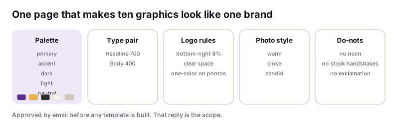
Start from the logo or the website: one primary, one accent, one dark for text, one light for backgrounds, one neutral. Pull hex codes with Canva’s color picker on the uploaded logo, or Coolors from a photo. Check contrast: dark text on light must pass (Canva’s accessibility checker or a quick squint test at thumbnail size).
Type pair (two fonts)
One for headlines, one for body. Safe pairs: a serif headline with a sans body (Fraunces + Inter) or a bold sans with a lighter sans (Montserrat 800 + Montserrat 400). Both must exist in Canva. Never three fonts.
Logo rules
Where it goes (bottom-right at 8% width is a safe default), clear space, the one-color version for busy backgrounds, and never stretched.
Photo style
Three adjectives (warm, close, candid) and a lighting note. If the client has no photos, decide now: wordless AI backgrounds (textures, scenes without people) or stock with a license. No AI-generated faces; they date instantly and clients notice.
Three do-nots
From the client’s own words on the call: no neon, no stock handshakes, no exclamation marks. Write them down; they save a revision round each.
Sign-off
Send the sheet as a one-page PDF. “Reply ‘approved’ and I start the templates.” That reply is your scope.
Worked example
Primary #C9A24B (gold: headlines, accents, never large fills) · Accent #7A6B4F (bronze: small details) · Dark #2B2B2B (text) · Light #F7F3EC (backgrounds) · Neutral #E6DFD3 (dividers, story frames). Headline: Cormorant Garamond 600 · Body: Inter 400/600. Logo: bottom-right, 8% width, one-color cream on photos. Photos: warm, close, natural daylight; product on linen or skin, never on white studio for social. Do-nots: no “stunning/gorgeous”, no neon, no exclamation marks.
Instructions you can copy (prompts)
Copy the instructions, replace the words inside {braces} with your details, and paste them into your AI tool. Check and edit the answer.
Here is what I know about {business}: logo colors {hex codes}, website fonts {fonts if known}, their current posts described: {describe 3 posts}, their words about style: “{client quotes}”. Write a one-page brand sheet: a 5-color palette (primary, accent, dark, light, neutral) with hex codes and one line on when to use each; a two-font pair available in Canva with weights for headline and body; logo placement rules; photo style in three adjectives plus a lighting note and a decision on AI backgrounds vs stock; three do-nots in the client’s words. Flag anything I should confirm with them.
Build the brand sheet for Juniper & Gold (capstone page) or a real client, lay it out in Canva as one page, and paste the palette, font pair and three do-nots below.
Done when: A one-page sheet the client could approve by email.. Sign up to save your work to your account.
Quick knowledge check
3 questions, 60% passes. Checkpoints, the certification exam (three versions) and the reviewed final project are unlocked with a free account.
- Why does the brand sheet come before any template?
- How many fonts?
- AI-generated faces in a brand pack are: